During today's lesson we discussed the meaning of "Golden Hour"
We learnt how the first and last hours of the daylight can give a soft and defused light, I find it calming and ambient on lovely sunset evenings with the orange glow. The photograph opportunities can be amazing. An example of this


Golden Hour View from My Back Garden.
Beautiful Warming Colours.
During the day, the bright overhead sun can create too-bright highlights in turn over exposing is high and it doesn't seem as relaxing and calming as the golden hour, the contrast is less during the golden hour and shadows are less dark, and highlights are less likely to be overexposed.
We also learnt about Juxtaposition which I find very interesting how a photograph can be deceptive with objects positioned in a certain way, they can be misleading and give a sense of visual irony. A prime example of this is Heuri Carlos Bresson he produced .

Which shows the lady apparently holding the clouds after the floods in Asia? This is such a fascinating topic as the perception is not how it seems.
-----------------------------------------
Jane Bown

Born in 1925 in London
In 1990 she exhibited her work 'The Gentle Eye' in the Nation Portrait Gallery In London
Photographing famous people earned her critical acclaim. She shoots in black and white and still uses her 40 year old camera, She has the talent of being able to photography her subjects with just available light. She even took Queen Elizabeth II 80th birthday portrait and she was awarded a MBE in 1985 and was later upgraded to CBE.
Here are a few of her photograph's

----------------------------------------------------------
Lee Friedlander

Born 14th July 1934
An American photographer and artist who at the age of 14 was introduced to photography he used a 35mm camera black and white,
He famously photographed Madonna nude in the late 70s and these photographs appeared in the September 1985 edition of playboy and in 1995 one of these images sold for $37,500 at the Christie's Art house Auction.
He went on to publishing a number of books, A lot of his work featured shop front reflections and structures. In 1963 he showed his first exhibition at the International Museum Of Photography. He first found work photographing jazz musicians for album covers and soon moved onto commercial work and teaching till the 1960's. He has the ability to pack his images with visual information that carries both formal and social meanings second to none. Here are a few examples of his work


------------------------------------------------------------------------------------------------------------------------
4/10/2011
System's and Processes
Camera Functions
•Sensitivity, film or sensor
•Exposure Mode (M,A,S,P Nikon), (M,Av,Tv,P Canon)
Compose, Focus, Visualize and Capture were some of the topics discussed in the lesson
1 Film Speed (light sensitivity) ISO, ASA
2 Shutter speed (time) seconds
3 Aperture (size of diaphragm) f –
4 Exposure reading/check
5 Focus (auto or manual)
6 Compose, frame and capture
Shutter speed setting represents the seconds in which the shutter will be open. When using shutter priority on the camera it will automatically select the best aperture size for the shot. The shutter speed setting would be best used to capturing freezing or blurring shots, this would give great photographs when capturing motion, but a tripod would be recommended to prevent camera shake.


Aperture represents the size of the diaphragm, the size the camera opens to when taking the photo, if you were to use the camera on aperture settings it would automatically select the best shutter speed. Aperture is represented with f stops and the largest number equals the smallest opening. Aperture setting would be best used for depth of field photography including portrait. There are a number of factors affecting the depth of field like the equipment being used as a phone camera only has a small sensor with infinite d.o.f. So the smaller the image size a larger d.o.f is attained and also the smaller the focal length the larger the depth of field would be, which will give the effect of blurring out the background and focusing on the person being photographed. The name used for this effect is known as Bokeh which is the Japanese word for blur/haze. The smaller the focal length the larger the depth of field would be, which will also give the effect of blurring out the background. When increasing the aperture you will need to incrementally decrease the shutter speed in order to get a good shot, while the increments are what photographer's refer to as 'stops' which could be aperture, shutter speed or ISO.


ISO represents the light sensitivity when using the camera in manual mode, if you select the ISO it will determine the levels of light in which the camera will allow in for the exposure
ISO 100

ISO 400

ISO 1600

--------------------------------------------------------------------------------------------------------------------------------------
Picture Project Portrait
We were set a project to photograph a black and white portrait and I really enjoyed this project it was good as I have a Passion for portrait photography and here are my results the first one being the one i presented as my chosen photograph.


Our project details =
Shoot a black and white portrait using natural, available light. Focus on
the eyes and set the aperture to its maximum i.e. smallest number. F1.8,
Things to consider:
Black and White, portraits, Jane Bown, 50mm lenses, wide apertures,
aperture priority, bokeh effect.
---------------------------------------------------------------------------------------------------------------------------
Picture Project Landscape


All the above are the results i got.
Our Project details =
•DSLR set to 200 ISO, RAW, Shutter priority (S, Tv
•Tripod
•Remote or cable release
•Polythene bag
•Tape measure
•Step ladder (optional)
•200 ISO (drop to 100 if there is a lot of light
•Tv or S for shutter priority mode, or manual (M)
•RAW or finest quality jpeg
•Manual focus
•Daylight colour temp setting
--------------------------------------------------------------------------------------------------------------------------------------
Project Vase and Flowers


Not very good results with these photographs, I would say this is down to compositional values. Although if I had to choose one I would have picked the first image with the red tints. It seems to have more compositional values and the effect i was trying to achieve which was to highlight the white flowers while flowing soft red to enhance the red and black flowers.
These seem to be a lot better compositionally as this time I thought about the lights, composition and focus points.


I sort of enjoyed this project but not as much as the portrait project, when we were told what the subject was i must admit i really wasn't that enthusiastic about it. Then when i come to shoot it i found it quite fun playing and experimenting with the lights and shadows. I got the lighting effect i wanted though so that was a bonus but the best part of it was the vase wasn't going anywhere unlike when shooting the portrait photo's.
--------------------------------------------------------------------------------------------------------------------------------------
Ansel Adams

Ansel was born in San Francisco California in February 1902 and passed away April 1984 he was an American photographer and environmentalist. In 1916 he was taken to Yosemite National Park with his family and fell in love with the place, he was amazed at how the light seemed to be everywhere. It was on this trip that his father gave him his first Kodak Brownie Box Camera and he began to take his first photograph. Ansel had a love for music and he had plans to make a career in the music industry after learning to play the piano himself he grew fond of it and began to teach others how to play in turn making himself an income. A year after his family trip to Yosemite National Park he decided to go back again only this time he went equipped with better cameras and a tripod. The photographs he took then went on to make him a small fortune. His first photographs were published in 1921 and Best's Studio began selling his Yosemite prints the following year. Anson produced his first portfolio in 1927 which was Parmelian Prints of the High Sierras, this portfolio included his famous image Monolith, the face of half dome which is known worldwide.
Ansel then went on to put on his first solo museum exhibition at the Smithsonian Institute in 1931, this exhibition included 60 of his High Sierra photographs. Ansels images were first used for environmental purposes when the Sierra Club was seeking the creation of a national park in the Kings River region of the Sierra Nevada.

After many years taking photographs of landscapes he decided to broaden his subject matter to include still life and close-up photos, He emphasized the use of small apertures and long exposures in natural light, Rose and Driftwood is a brilliant example of his still life photography, it is absolutely beautiful the lighting is superior and it's such a delicate photograph, certainly one i would display on my walls.
Over the years Ansel became more and more interested in photography using mainly large format cameras for the high resolutions to enable the sharpness in his photographs and he soon became famous as his photographs are now known worldwide. He developed the zone system with Fred Archer as a way to get proper exposure and enable adjustments on the contrast for the final print.
He also founded the group F/64 with Willard Van Dyke and Edward Weston which was a group of seven photographers who shared a common photographic style characterized by sharp-focused and carefully framed images seen through a particularly Western American viewpoint. Ansels photography career just grew and grew and he achieved a lot during his time, he won numerous awards and even had awards named after him. He received a Doctor of Arts from both Harvard and Yale Universities; He was awarded Conservation Service Award by the Department of Interior, elected a Fellow of the American Academy of Arts and Sciences in 1966. He was introduced to the California Hall Of Fame by Arnold Schwarzenegger and first lady Maria Shiver in 2007, Presidential Medal Of Freedom in 1960 he received the Sierra Club John Muir Award in 1963 also
The Minarets Wilderness in the Inyo National Forest and a 11,760-foot (3,580 m) peak was renamed the Ansel Adams Wilderness and Mount Ansel Adams respectively in 1985. The Sierra Club Ansel Adams Award for Conservation Photography was established in 1971 followed by the Ansel Adams Award for Conservation in 1980 by The Wilderness Society. All these awards don't have been the results from his hard work and in turn his photographs are reproduced on calendars, posters, and in books, making his photographs widely distributed throughout the world.
Ansels was often criticized for not including humans in his photographs and for representing an idealized wilderness that no longer exists. However, it is in large part thanks to Ansen that these pristine areas have been protected for years to come and for future generations to enjoy.
Bibliography - www.wikipeadia.com
------------------------------------------------------------------
PRINTING PAST AND PRESENT
In the 1400’s when Gutenberg developed the first printing press it was slow and expensive to print anything. Even then people were clamoring for a way to quicker and less expensively produce short-run printed material. The ability to print four-color short-run material was next to impossible to do before the merging of old technology, the printing press, and new technology, computers, This created a new area of printing, Digital Printing Technology.
E6 PROCESSING
E6 processing became popular in the 1970s and for years it was the preferred choice for photographers who wanted to achieve the ultimate quality, because of E6 processing tonal ranges are a lot richer, with smoother hues that are simply not achievable with modern-day digital software. It also produces a velvety grain structure, and cleaner, smoother colour graduation.
E6 includes the element to photography where exposure and precision have to be accurate to create fantastic looking results. It holds on to that anticipation, that excitement when awaiting your film and keeps the element of spontaneity in photography.

Unfortunately as modern life moves on, so does technology and therefore despite the abundance of praise about its qualities the E6 processing is sadly rolling down hill to the past, resulting to modern images on mobile phones and digital camera images requiring quick prints with no excitement at all.
Six-bath process version
The steps for developing color transparency films using process E6 are:
- First developer bath: 6:00 @ 100.0 °F. This uses a potassium hydroquinone monosulfate -phenidone black & white film developer, with the preferred form of phenidone being 4-hydroxymethyl-4-methyl-1-phenyl-3-pyrazolidinone (13047-13-7). The first developer forms a negative silver image in each layer of the film. The first developer is time and temperature sensitive because it controls contrast.
- First wash: Water stop bath, 2:00 @ 100.0 °F. This step once used an acetic acid stop bath, but was replaced with a water-only bath for process economy, with concomitant slight reduction of first developer strength.
- Reversal bath: 2:00 @ 96-103 °F. This bath prepares the film for the color developer step. A chemical reversal agent is absorbed into the emulsion, which is instantly effective. The reversal step can also be carried out using 800 footcandle-seconds (8.6 klx·s) of light - this variation is used by process engineers to troubleshoot reversal bath chemistry problems such as contamination and issues of low tank turnover as process volumes decline.
- Color developer bath: 6:00 @ 96-103 °F. This step is carried out to completion. The developer contains CD-3 developing agent, and acts upon the chemically exposed silver halide that was not developed in the first developer to form a positive silver image. The metallic negative silver image formed in the first developer has no part in the reaction of this step. As the color development progresses, a metallic positive silver image is formed and the color developing agent is oxidized. Oxidized color developer molecules react with the color couplers and color dyes are formed in each of the three layers of the film. Each layer of the film contains different color couplers, which react with the same oxidized developer molecules but form different color dyes. Variation in color developer pH causes color shifts on the green-magenta axis with Kodak E100G & E100GX and Fujichrom films and on the yellow-blue axis with older Ektachrome films.
- Pre-bleach bath: 2:00 @ 90-103 °F. This bath was previously called "conditioner", but was re-named pre-bleach in the mid-1990s to reflect the removal of formaldehyde from the process used in the final rinse. In this solution, formaldehyde acts as a dye preservative and EDTA is used to "kick off" the bleach. The pre-bleach bath relies on carry-over of the color developer to function properly; therefore there is no wash step between the color developer and pre-bleach baths.
- Bleach bath: 6:00 @ 92-103 °F. This is a process-to-completion step, and relies on carry-over of pre-bleach to initiate the bleach. The bleach converts metallic silver into silver bromide, which is converted to soluble silver compounds by the fixer. During bleaching, iron (III) EDTA is converted to iron (II) EDTA (Fe3+ EDTA + Ag + Br−→ Fe2+ EDTA + AgBr) before fixing. Kodak also has a process variant which uses a higher concentration of bleach and a 4:00 bath time; but with process volumes declining, this variant has become uneconomical.
- Wash step (optional): Rinses off the bleach and extends the life of the fixer bath. This wash step is recommended for rotary tube, sink line and other low volume processing.
- Fixer bath: 4:00 @ 92-103 °F. This is a process-to-completion step.
- Second fixer stage (optional): Using fresh fixer. The archival properties of film and paper are greatly improved using a second fixing stage in a reverse cascade. Many C-41RA (rapid access) minilab processors also use 2 stage reverse cascade fixing for faster throughput.
- Final wash: 4:00 @ 92-103 °F.
- Final rinse: 1:00 @ 80-103 °F. Up until the mid-1990s, the final rinse was called a stabilizer bath, since it contained formaldehyde. Currently, the final rinse uses a surfactant, and miconazole, an anti-fungal agent.
- Drying: Drying in a dust-free environment
http://en.wikipedia.org/wiki/E-6_process
http://www.bjp-online.com/british-journal-of-photography/news/1650026/is-e6-processing-nigh
http://www.basiccameraphotography.com/film_photography/e6_film_processing_steps.php
---------------------------------------------------------------------------------------------------------------------------
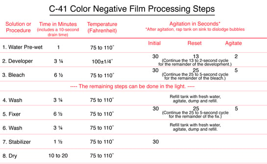
C41 PROCESSING
.gif)
C-41 is a formula designed for color processing. As all commercial photo labs use the C-41 color process, film suppliers like Fuji, Kodak and Agfa created Black and White C-41 films to enable commercial labs to use the same process for both black-and-white and color films. Digital photography is, however, slowly taking over film processing, forcing many small labs to stop film processing altogether. If you still enjoy film photography, you might have to consider home processing; Film should be processed in complete darkness.
C-41 film consists of an acetate or polyester film base, onto which multiple emulsions are coated. Each layer is only sensitive to a certain color of visible light. In the classic illustrative example, there are three emulsions: one is red sensitive, another is green sensitive, and the last is blue-sensitive. The top layer is blue-sensitive. Beneath the blue layer is a yellow filter, composed of dyes or colloidal silver. All silver-based photographic emulsions have some sensitivity to blue light, regardless of what other colors they may be sensitized for. This filter layer serves to remove the blue light, which would expose the layers beneath it. Beneath the blue-sensitive layer and the yellow filter are the green and red sensitive layers. The illustrative example outlined above differs from the design of actual film, in respect to the number of layers. Almost all C-41 films contain multiple layers sensitive to each color. Each of these layers has different speed and contrast characteristics, allowing the film to be correctly exposed over a wider range of lighting conditions. In addition to multiple emulsion layers, real films have other layers that are not sensitive to light. Some films are top-coated with UV blocking layers or anti scratch coatings. There also may be layers to space different emulsions, or additional filter layers. C-41 Processing cannot be done on TRUE black and white negatives. Each emulsion layer, in addition to the light-sensitive components, contain chemicals called dye couplers. These couplers, located in the blue, green and red-sensitive layers, produce yellow, magenta and cyan dyes, respectively, when developed. 
The C-41 process is the same for all C-41 films, although different manufacturers' processing chemistry's vary slightly.
After exposure, the film is developed in a "color developer". The developing ingredient is a paraphenylene diamine-based chemical known as CD-4. The developer develops the silver in the emulsion layers. As the silver is developing, oxidized developer reacts with the dye couplers, resulting in formation of dyes.
The control of temperature and agitation of the film in the developer is critical in obtaining consistent, accurate results. Incorrect temperature can result in severe color shifts or significant under or over-development of the film.
After the developer, bleach removes the metallic silver generated by development. After the bleach, a fixer removes the unexposed undeveloped silver halide. This is followed by a wash, and a final stabilizer and rinse to complete the process.
There are simplified versions of the process that use a combined bleach fix that dissolves the silver generated by development and removes undeveloped silver halide. These are not used by commercial C-41 processors, and are marketed for home or field use.
http://photo.net/black-and-white-photo-film-processing-forum/?category=C-41+Process+B%26W+Film
http://en.wikipedia.org/wiki/C-41_process
http://www.ephotozine.com/article/developing-a-c41-colour-film-4699
---------------------------------------------------------------------------------------------------------------------------
DIGITAL PRINTING
Digital printings were developed in the 1960s when the cost of processing was fairly high, however, with the computing equipment of that era. That all changed in the 1970s, when digital image processing proliferated as cheaper computers and dedicated hardware became available. Digital printing takes a different approach assembling each image from a complex set numbers and mathematical formulas. These images are captured from a matrix of dots, generally called pixels, this process is called digitizing. The digitized image is then used to digitally controlled deposition of ink, toner or exposure to electromagnetic energy, such as light, to reproduce images. The mathematical formulas also allow for algorithms to compress the data. It also give a method of Calibration or Color Management Systems which helps to keep images looking the same color despite where they are view or printed. One important function that the mathematical formulas allowed was the development of a common language for digital printing it is called PostScript and was developed by Adobe. To see what PostScript looks like open a PDF or EPS in a text editor, the code seems very intricate but to a computer it just a simple code of instructions.

One of the most important advantages that Digital printing offers is a quicker response time due to its minimal press setup and it’s built in multicolor registration system. This eliminates many of the upfront, time consuming processes that can cause analog printing methods to have a slower turn-around time. Another advantage of Digital printing is the ability of offer variable printing; this means that each printed piece can have different information on it providing personalization and customization unmatched by analog processes The main difference between digital printing and traditional processing such as lithography, flexography, gravure or letterpress is that no printing plates are used, resulting in a quicker and less expensive turnaround time. The most popular methods include inkjets or laser printing that deposit pigment or toner onto a wide variety of substrates including paper, photo paper, canvas, glass, metal, marble and other substances. Consumer and professional printers such as inkjet or laser printers use the most common examples of digital printing. Professional companies now use those practices to go green by using better quality ink and better laser etching to get a crisper picture that is displayed through digital printing.
In many of the processes the ink or toner does not permeate the substrate, as does conventional ink, but forms a thin layer on the surface and may in some systems be additionally adhered to the substrate by using a fuser fluid with heat process toner or UV curing process ink.

http://en.wikipedia.org/wiki/Digital_printing
http://www.pchardware.co.uk/printers.php
http://www.blackwellprint.co.uk/blog/printing-leaflets-flyers-business-cards-folders/2009/12/digital-printing-explained/
In many of the processes the ink or toner does not permeate the substrate, as does conventional ink, but forms a thin layer on the surface and may in some systems be additionally adhered to the substrate by using a fuser fluid with heat process toner or UV curing process ink.
http://www.pchardware.co.uk/printers.php
http://www.blackwellprint.co.uk/blog/printing-leaflets-flyers-business-cards-folders/2009/12/digital-printing-explained/
-------------------------------------------------------------------
Giclée
Canvas is the most popular of all art media. Fine art reproductions, contemporary art, abstract art, original paintings and digital photos can be turned into canvas prints.
Printing on fine art materials such as canvas and watercolor papers is often referred to as Giclee. The French term “Giclée” (pronounced zhee-clay) means to spray or squirt, which is how an inkjet printer works. However, it is not the same as a standard desktop inkjet printer, and is much larger at over a meter
Printing on fine art materials such as canvas and watercolor papers is often referred to as Giclee. The French term “Giclée” (pronounced zhee-clay) means to spray or squirt, which is how an inkjet printer works. However, it is not the same as a standard desktop inkjet printer, and is much larger at over a meter
The Term giclee print connotes an elevation in printmaking technology. Images are generated from high resolution digital scans and printed with archival quality inks onto various substrates including canvas, fine art, and photo-

Antique Prints are precious and finite resource, limited to the fragile durability of the Printing surfaces e.g. copper is soft and the engrave lines experience wear leading to lack of definition. Add to that the lack of disposable income and general education of past generations the demand was naturally limited. Significant advances in giclee inks have resulted in prints with broader, more saturated color ranges and longevity. Epson are one manufacturer of giclee inks who make light fastness claims that their Ultra Chrome pigment based inks last in excess of 75 years. Epson’s pigment based inks use eight individual colors, including black (photo or matte), light black, cyan, light cyan, magenta, light magenta, and yellow. A common misconception is that all inkjet inks are archival inks. Pigment-based inks last a lot longer than dye-based. Even special UV stable dye inks used for fine art may fade as quickly as 13 years. Under the right conditions new dye-based inks on the market may last as long as 60 years, but there is significant loss of color range and they only provide longevity on certain print medias. There are reputable companies offering art reproduction using inks that will fade in as little as a year, and unfortunately some of these printers don’t inform their customers. It's important that consumers have all the information they can get, so that artists and photographers can make an intelligent and informed decision, and can be sure prints will last.

------------------------------------------------------------------
Great British Picture Project
We had to produce a photograph which represented Great Britain, there are a number of things that could be used to represent Great Brain as it is world known for it's music, football, golf, boxing, cricket and tennis. Then its famous for fish and chips, roast beef dinners, and mass tea drinkers. Great Britain has invented a number of things including trains, television and lightbulbs just to mention a few. There is also a great number of photographers who have documented Great Britain over the years including Don McCullen as seen with the image below.

----------------------------------------------
I chose to photograph a number of item that i thought represented Great Britain including

Full English Breakfast

Great British Flag with a true representation of a Great British cloudy sky

This one I was impressed with as the cloud behind the flag has a look of being the shape of the English flag

This is the one that my tutor chose as it represents a Great British pensioner within her environment.
This really was enjoyable for me as I had to think hard about what I thought represented Great Britain in the best possible way, the list was endless and so I chose all the above.
------------------------------------------------------------------------------------------------------------------------------------
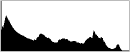
Histograms/Levels
Each pixel in an image has a color which has been produced by some combination of the primary colors red, green, and blue (RGB). Each of these colors can have a brightness value. A RGB histogram results when the computer scans through each of these RGB brightness values and counts how many are at each level. Other types of histograms exist, although all will have the same basic layout as the histogram example shown below.


2 stops underexposed

---------------------------------------------------------------------
2 stops overexposed

---------------------------------------------------------------------
Normal Exposure
Although histograms are a fantastic way of enableling us to see exposures, there are also number of way in which errors could be rectified with the use of Photoshop software histograms, colors, contrasts, exposure, unwanted items and many more can be corrected.
Below is a fantastic example of histograms and adjustments in photoshop which is what I came across while researching this subject
The levels dialogue box, first look at the histogram and how to use it to adjust an image to look much punchier.
1. Open your image in Photoshop.
Choose File > Open or double-click a thumbnail in the File Browser in Photoshop CS or Bridge in CS2.. Before you start making adjustments, evaluate the image tonality. Is it too light or dark? Does it have too much or too little contrast? Is there a color cast?
2. Create a new Levels adjustment layer.
Choose Layer > New Adjustment Layer > Levels, and then click OK in the New Layer dialog box. You can also open the Levels command by choosing Image > Adjustments > Levels. However, with an adjustment layer, you are applying the tonal correction on a separate layer. The original image is untouched. If you decide you don't like your changes, you can change them at any time or simply discard the adjustment layer and return to your original image.
Enter the histogram....
A very useful tool for evaluating an image's tonality is the histogram displayed in the Levels dialog box. A histogram illustrates graphically how the pixels which go to make up an image are distributed, by mapping the number of pixels at each color intensity level. In other words it shows you the distribution of pixels in the image in graphic form. The shadows are shown in the left part of the histogram, the midtones are shown in the middle, and the highlights are shown in the right part of the graph.

In this image of a mute swan you can see the distribution of pixels in the histogram - those to the extreme left represent the very small number of pixels that are very dark (the black on knob of the swan's beak for example). The bulk of the pixels are in the midtones (which represent the water and reeds). The area to the extreme right represents the highlights - and notice that they are bunched right up to the right of the graph and beyond. You may have noticed that there is also a tall spike at the extreme right of the box.. This is indicative of over-exposure, the highlights are "blown or clipped " If you look at the swan itself, you can see that this area corresponds to the wing and tail - which has burnt out to pure white and it is not possible to distinguish the feathers - not good.
Now look at the shadow part of the graph. It is not clipped at this exposure level, so in this example, it would have been better to have underexposed the shot by around half to one f-stop at the time of shooting it in order to retain the missing highlight detail. This would have driven the graph to the left - at the expense of the shadow detail. If we overdid it, the shadows would then start to clip !
This scene of the swan is very "contrasty" as it is in full sunshine - i.e. has a very large dynamic range. That is to say, the blacks are very black and the whites are very white and shadows are strong and harsh under such conditions.
A bright-overcast day offers less contrast than full sunshine and is often preferable for photographing white subjects - where your aim is probably to retain detail in the shadow and highlight extremes. On a really grey day, the contrast is lower still - blacks look greyer and highlights also look greyer, so it becomes easy to capture the full dynamic range of the scene, but as grey days offer very "flat" lighting with few shadows, pictures tend to look bland and unexciting.
Another way of lowering contrast is to use a reflector or fill-flash to lighten the shadows - but this would not have been very practical with our swan example.
You will quite often find that you will come across scenes which have a greater tonal range (dynamic range) than the camera can handle - both shadows and highlights are clipping. Under these circumstances you will have to decide which are more important to your image and expose accordingly. It is possible to combine over and under-exposed images together in Photoshop to produce a high-dynamic range (HDR image) but this is beyond the scope of this tutorial.If your camera is a digital slr, you should be able to check the histogram on the back of the camera immediately after taking the shot. Look for "clipped" highlights or shadows and adjust the exposure accordingly and retake the shot if necessary. Some cameras have a setting where you can set the highlights to blink in the areas of over-exposure.
The correctly exposed shot
The next image of a collared dove is perfectly exposed - no clipped highlights or shadows, it was easy for the camera to get this right as the scene is predominantly mid-tones with no extreme highlights or shadows to cause problems of clipping. The full "dynamic range" of the scene has been captured. Even so, we can improve the look of this image and give it far more "punch" by adjusting the levels a bit. So let's pep it up:

Adjusting the levels by setting the shadow and highlight sliders.
1.0 Move the Black Point Input slider (located directly beneath the histogram) inward from the edges of the histogram. Moving the Black Point Input slider maps all image values at its position or below to the Output Levels black point (set by default to 0, or pure black). This will blacken up the shadows and add more of a contrasty feel to your image, but don't overdo it - as you will losing shadow detail in the process.
2.0 Similarly, moving the White Point Input slider maps image values at its position or above to the Output Levels white point (set by default to 255, or pure white). For example, if your image is too dark, move the Input White Point slider to the left. This maps more values in the image to 255 (the Output Levels white point), making them lighter. If there are important highlight details in this part of the histogram - such as subtle detail in the feathers of a swan, you will loose them - as you are making these values pure white, so be careful. In this example of the dove, the pale areas around the bird's eye and chin will be sacrificed just a little to give the image a little lift.
A good starting point for many images, is to adjust the sliders up to where the histogram begins to rise steeply at each end as I have done above example. Compare the two images of the dove and you will see how washed-out the first image looks compared to the adjusted one.
As you move the highlight slider you will notice that the middle (midtone) slider adjusts itself automatically - which is useful.
3.0. Adjust the midtones in the same way by moving the middle input slider to the left to lighten the image or to the right to darken the image in the mid-tones. The middle input slider actually adjusts the image gamma. It moves the midtone (level 128) and changes the intensity values of the middle range of grey tones without dramatically altering the highlights and shadows.That's all there is to it. When finished click OK to apply the levels adjustments - job done.
4.0. Removing color casts within levels.Select the Set Grey Point Eyedropper tool in the Levels dialog box. Click an area in the image that contains only a grey tone, or an area containing as few colors as possible. It's easier to color balance an image by first identifying an area that should be neutral and then removing the color cast from that area. With such a correction, all other colors in the image should be color balanced, too. The eyedropper tools work best on an image with easily identified neutrals.
If there are no easily identified neutrals in your image, the Levels command may also be used to adjust individual colour channels (red, green or blue) to remove a color cast. Choose a channel from the Channel menu of the Levels dialogue box and then adjust the Input sliders for either red, green or blue.Many images with a blue sky in the picture benefit from moving the blue channel slider a little to the left in the highlights - it really perks up the sky - try it for yourself.

The under-exposed shot
This image of a nuthatch was purposely under-exposed to illustrate a point. (Well that's my excuse and I am sticking to it) :
See how the shadows are clipped off at the left hand side of the graph ? The mid-tones are bunched up to the left, and the highlights are most definitely not clipped - they seem to drag on forever along the baseline.
Can the levels adjusters deal with this situation and retrieve the image ? The answer is essentially yes, but there is a price to pay in terms of " noise". Digital noise is the unsightly equivalent of film grain and is usually concealed within the dark areas of the image. If we open up the shadows and midtones using the levels sliders, this will expose the noise to the detriment of the image. If the image was really precious to us, there are several good noise-reduction filters available (such as Neat Image, Noise Ninja and Photoshop's own noise filter) which will help a lot in reducing noise without loosing too much detail and sharpness in the image.
To demonstrate this noise, here is the adjusted image of the Nuthatch at 200% so you can see the noise in the red-circled area .I have purposely over-sharpened the image a bit to show it more clearly here.
Below is the equivalent from the correctly exposed image. Notice how the noise in the circled area is much lower. It is difficult for me to illustrate this very clearly on this website as the images are such low resolution here, but hopefully you can get the general idea. The examples are using images shot at low ISO (200). If they had been shot at high ISO in order to gain shutter-speed on a dull day the noise would have been much worse.
More histogram examples
Let's look at a few more histograms and endeavor to interpret what they are telling us:
Here is an easy image for the camera to get right - it is predominantly midtones (hence the huge mid-tone peak) - all the highlights are captured without clipping. There is a bit of clipping in the extreme shadow area to the left of the histogram - but this only represents the few black shadows between the planks which I am more than happy to allow to go to 100% black as they are non-critical and it even gives the image a bit of punch.

This is an image of a Puffin. The histogram looks very different to the last example. The three peaks to the right of the histogram represent the white on the bird, the sky, and I am guessing here - the pale coloured rocks. Notice that the three peaks are taller than the box ? This simply means that they go outside the scale of the box - they are not actually missing or clipped - and this is nothing to worry about.
The image looks a little bright at first, but the histogram tells us that we have (just) captured the full dynamic range of the image. I would simply adjust the midtone slider a little to darken the image - which will minimise noise and make a great picture. This is a good example of "exposing to the right " in action - click here to see the tutorial on exposing to the right.
This example also illustrates that histograms can look very different according to the scene - sometimes smooth and rounded - sometimes spiky like this one. There is not a right and a wrong as such - histograms just are !
This is a night image of Tower Bridge in London. At a first glance at the histogram, it looks under-exposed.
The image has a lot of dark night sky which has clipped to black, but I like the contrast that gives to this image - so that is fine by me. The midtones are mainly to the left of the image - which would normally suggest under-exposure, but look at the highlights - which are important in this picture - they too are starting to clip at the extreme end (the lights on the top of the building). I don't mind them clipping - as I am happy with them being pure white on this occasion. What I don't want is the light on tower bridge itself to clip - which it isn't . So despite the initial appearance of this image being under-exposed, it is not, at least it is not within the concept of what I am trying to achieve with the image.
Now let's say that I wanted to show a bit more light in the sky rather than the pure black that it is. Then I would say that the image is under-exposed! I would have needed to have shot the image with a little positive exposure compensation (say plus 2/3 of an f-stop). As I didn't I could now try opening up the shadows with the midtone slider, but I would soon start to expose unacceptable levels of noise in the image. So which is it - underexposed or not underexposed ? The answer depends entirely on what you are trying to achieve. Histograms are not always showing you right and wrong - they just showing you how it is - and you have to decide if it's right for you - this is supposed to be art after all !


-----------------------------------------------------------